


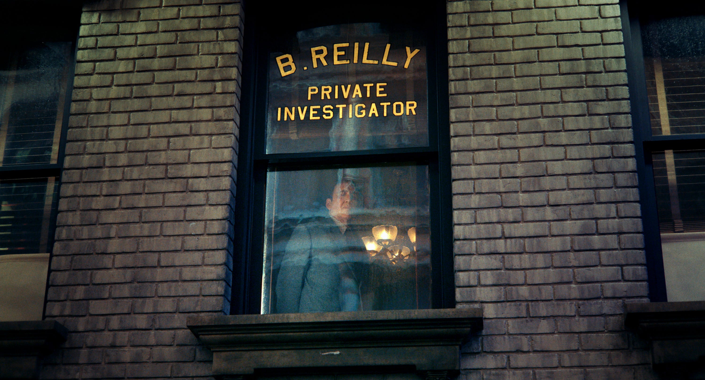
Spider-Noir is the latest television series in Sony’s Spider-Man Universe. It debuted on Prime Video to much fanfare from critics and audiences. A throwback to the hard-boiled genre mixed with the otherworldly vibe of comic books. It follows an aging private eye played by Nicolas Cage who is also a superhero in 1930s New York, grappling with his tragic past. The series is presented in “Authentic Black-and-White” and “True Hue Full Color”, showcasing the phenomenal Emmy-nominated work of production designer Warren Alan Young (Harriet, Fargo S4). Young recently spoke with Immersive about this exciting series.
[This conversation has been edited for clarity and context.]
Is Spider-Man or the Spider-Universe something that you’re into? What was it like when you first got this project? What were your thoughts?
I read comic books a lot when I was a kid. Spider-Man was one of my favorite characters, actually. The way the stories were structured and the illustrations fascinated me. The pitch from the creator of the show was… a middle-aged guy who moves a little slower than he used to… he’s got aches and pains, and he’s become a little cynical in his older age. I was like, “Oh, wow, this sounds really, really interesting.” I’m speaking about a different world, making it more human. That was really what caught my attention here. I think that’s part of what the audience has really latched onto.
Let’s talk a bit about practicality. What did you make for this? What was it like when you started building stuff? How much was there? It looks like a big show.
It is a big show, but it was a big show on limited resources. We did a lot with the resources that we had. My origin story in film and TV is the indie world, where you’ve got to create a whole lot of something with nothing. And it reflects a lot of my childhood. I grew up in a relatively poor household, and you had to figure out how to make things work. So the LA indie world during the early ‘90s, when I got in, was always short on resources. I’ve carried that mentality forward with me.
We shot all in Los Angeles at Sony Studios. We had between four and six stages at any given time. I think five typically. We also used the backlots of Universal Studios and Warner Bros. Studios, the New York Streets at both of those studios, and then Hennesy Street at Warner Bros. Studios. We used a little bit of downtown LA, the historic district, the bank district on Broadway, and then over at 4th and Maine, a known area for getting that old New York look.
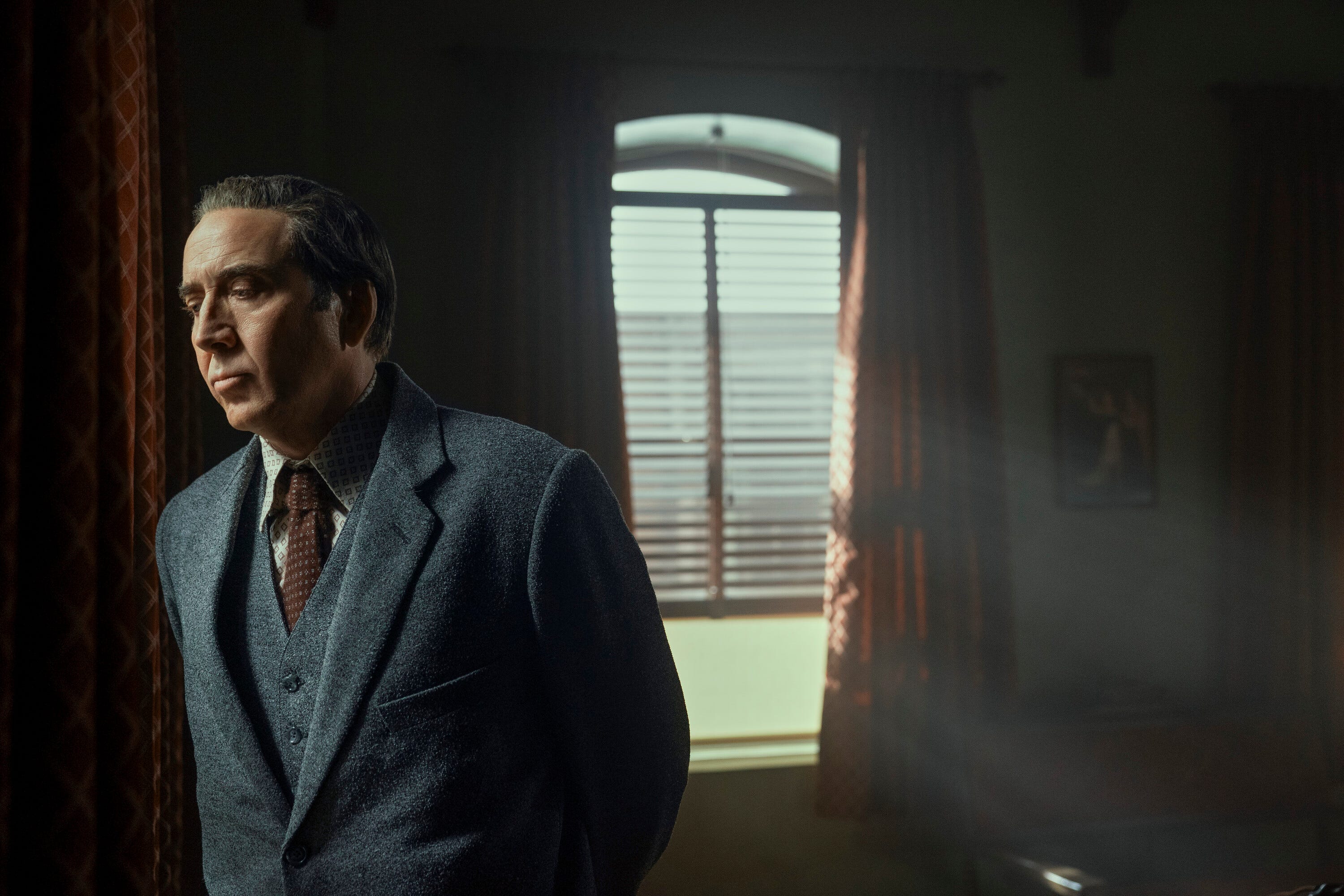
One of the things I’m particularly fascinated by is that I love his office. Talk a little bit about it. It feels like the quintessential Sam Spade, Jake Gittes, detective office.
I first saw The Maltese Falcon when I was about 10 years old. I couldn’t go to sleep, which was often the case, but as a result, I also saw The Treasure of the Sierra Madre, and The African Queen. I got to see these movies on TV as a young kid and was just blown away by the setting. I was enamored with Humphrey Bogart and his characters. I should also include Casablanca because it’s one of my favorites, but that’s definitely where I started with the Humphrey Bogart’s Sam Spade Office in The Maltese Falcon.
I feel, between the art direction, production design, and of course Nic, I really feel like I’m in a detective’s office in the 30s.
That’s the goal. As a production designer, you know that the audience isn’t going to connect to everything that you put up, but you hope that they do. We knew that there are people who are film noir fans and have an understanding of that environment, so that’s one of the areas where we really wanted to connect, not only for the audience, but also for the actors.
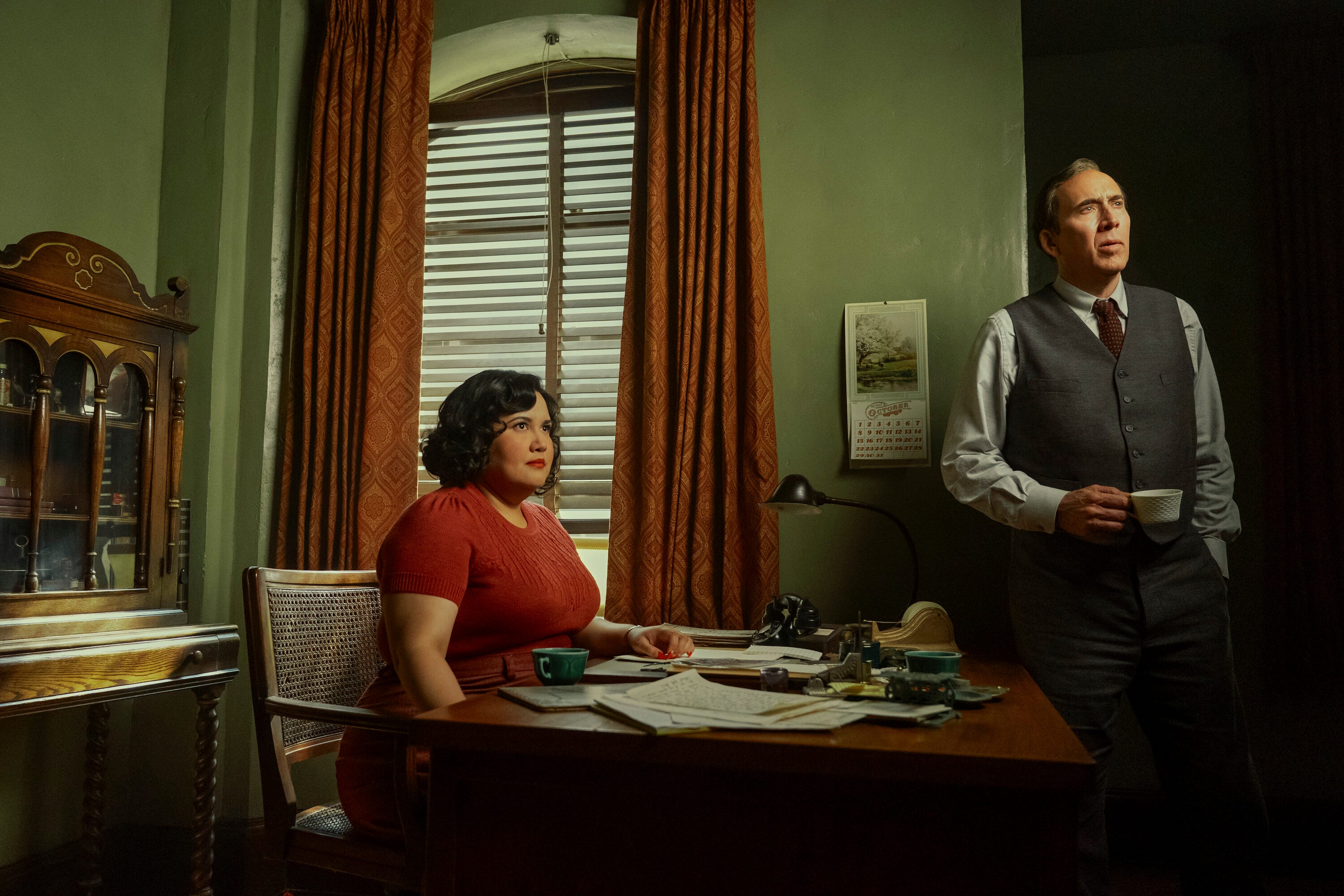
Anything particularly hard to pull off? I can imagine the two versions must have been a challenge…
When I was hired, the project was to be black and white. Then early in prep, the network came to us and said, “Let’s think about a color version of this.” They were getting nervous. We were charged with creating a look that was as visually interesting in color as the black-and-white version. That set us up to learn how we could do both at the same time. So there was a lot of testing throughout production.
The series was filmed with the Sony Venice camera. Sony provided my team and the costume design team with the Sony FX3, which is essentially a point-and-shoot camera that carries much of the same technology as the Sony Venice camera that we used to film the series. Through a LUT (Look Up Table), we had to understand what each fabric, paint, and wallpaper texture would look like in black-and-white and color versions. We needed to make sure that everything that looked good in black and white looked good in color, and the reverse.
We were trying to do something a little different and still be, you know, give some indication, not only of the comic book origins of it all, but also of what the world really looked like. Then fortunately, there’s some great color photography that we discovered, and I had seen from research on previous projects, that exists, to show you what things really looked like in those days.
Where did you find that?
The Library of Congress has color photography from the 40s, but also going even further back. So when Darren Tiernan and I started looking at color, one of the first things we looked at was autochrome, which is one of the earliest forms of color photography. Darren brought to my attention a book of autochrome photography where this photographer had found these old plates, cleaned them up, and reprinted them with some accents.
We thought we might be landing there, but that was really our jumping-off point for creating the color. The hardest part of the project was definitely creating the color look and feel that would also work with black and white, since both were shot at the same time. It was very time-consuming for the entire team to test every color, every texture, et cetera. You know, even colors on a sign that we would make, I had to make sure that the colors on those signs would work.
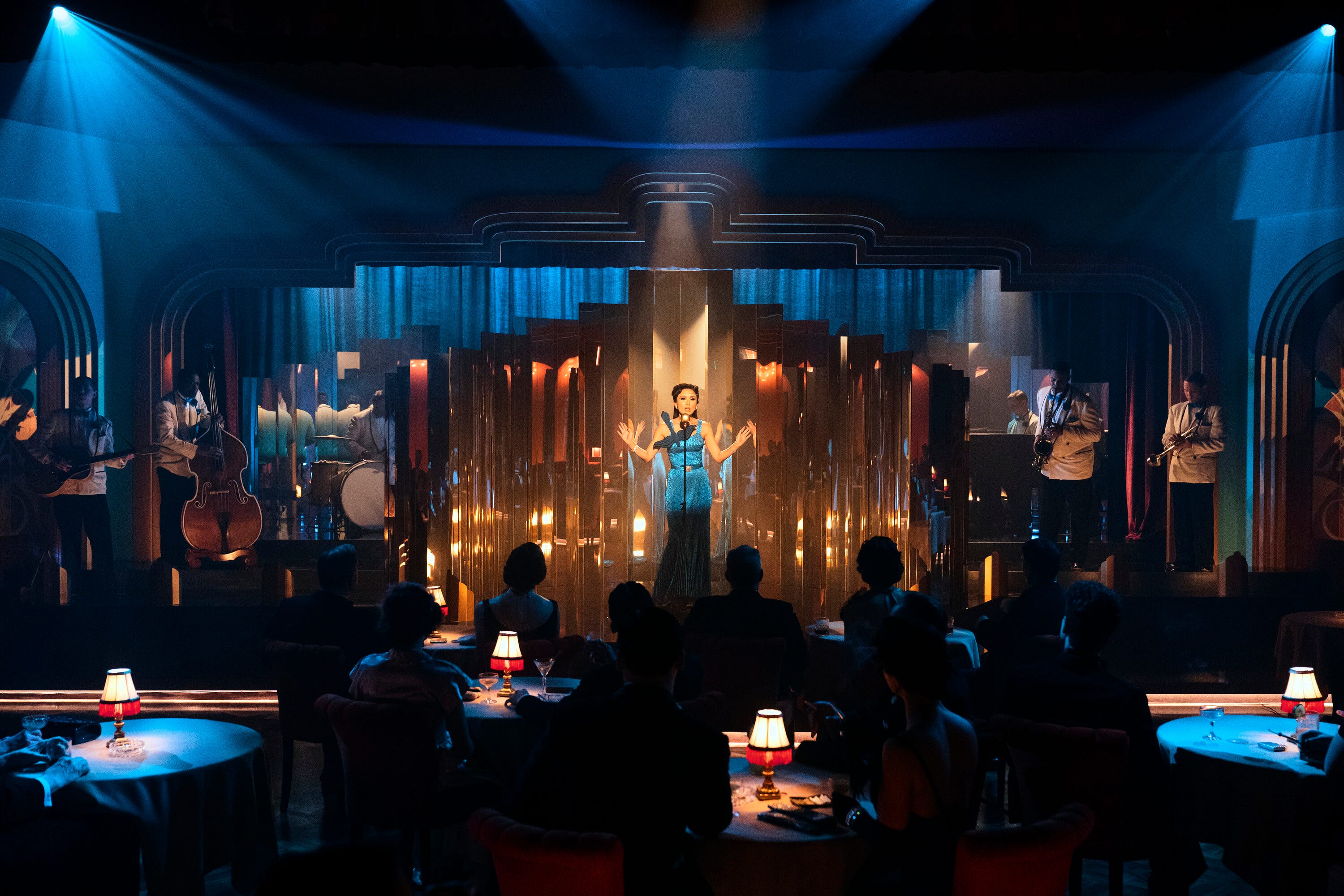
Any favorite pieces that you created?
I like a lot of the sets. My mind often goes back to the alcove, to the bar. Knowing that, you know, we’re gonna have a lot of grays and blacks in the black and white. I wanted to be able to provide more elements of visual interest throughout, and also to provide some light motivation for Darren. So you may have noticed in all of the columns and the pilasters in the bar, for example, the base and the capital of those pilasters and columns are illuminated. It’s a type of acrylic glass that we used, and that was lit. That was another collaboration with Darren and his team. This project worked on several levels because there’s so much amazing collaboration between all the different departments: costumes and cinematography, hair and makeup.
What’s it like being on the other end of this now? It’s such a great show, in my opinion.
The bar has been set for all of my future projects in several ways. Everyone involved was just amazing, and I had such a great time. It was a lot of work, but we had a blast.
Spider-Noir is steaming at Prime Video.